Note: This post was originally authored by Quincy Smith.
Think of a product page as the perfect storm where information, images, customer service, and minor details all come together to convert a customer. No matter how a user reaches your page, they expect to be informed and educated about your product as well as provided with details like options, cost, and availability. However, if even one of these aspects is lacking, missing or incorrect, expect your customer to jump ship in search of a site that can meet their expectations.
So, what can you do to make your product pages stand out, meet your users’ expectations, and increase conversions? In this post we’ll look at 5 proven tips that will do all of that and more.
1.Take Your Images Seriously
Customers rarely buy anything sight unseen so the quality and presentation of your pictures is hugely important. Not only are the images likely the first thing a visitor sees on a page, but they must serve as a substitute to actually holding and feeling a product. Because of this, they need to be detailed, interactive, and professional.
-
Bigger Is Better – Multiples studies have shown that bigger images yield higher conversions, even when they push the copy below the fold. Do not, however, increase size at the expense of quality, either use a better image or stick with the original.
-
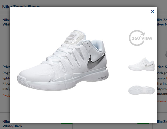
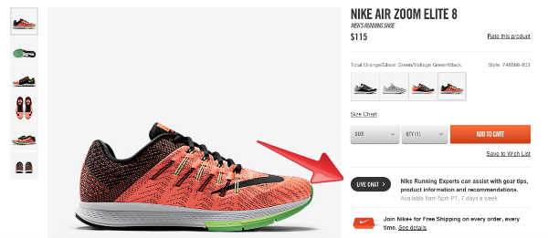
Offer Interaction Opportunities – Users should be able to zoom in on the details of the product and even rotate it with 360 degree imaging. If you offer multiple colors and really want to go above and beyond, ensure that your image changes based on the color selected. This vendor not only allows you to view a larger image of the shoe, but also offers different angles and the ability to rotate it 360 degress.
-
Be Consistent – Even if your images were taken over multiple years, customers should barely be able to tell. This means doing your best to use the same background, lighting, etc, so that people viewing dozens of images per session don’t see a difference.
2.Entice Them with Your Descriptions
As the often-quoted saying goes, content is king. This is true no matter what your product is or to whom you’re selling. Words are a highly proven yet sadly underutilized resource when it comes to forming bonds with customers. I know I am not alone when I say I am impressed with sites go above and beyond the classic bulleted list for their descriptions, it allows me to think a little deeper about the product and imagine myself using it.
-
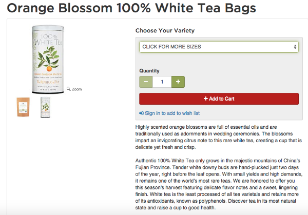
Tell a Story – Anyone that says they hate a good storyteller is lying. Use your description to introduce your product, tell the customer where it’s from, how it’s made, and how they can enjoy it. If the following description of tea doesn’t make you want a cup, then I don’t know what will.
-
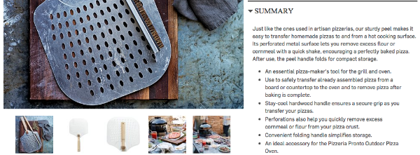
Be Creatively Detailed – Obviously you should include all the relevant details about your product, but don’t be afraid to get creative with it. If you can make a customer remember this description, you have done your job. William Sonoma (below) does a great job of explaining the features of their pizza peel and how you can use it.
-
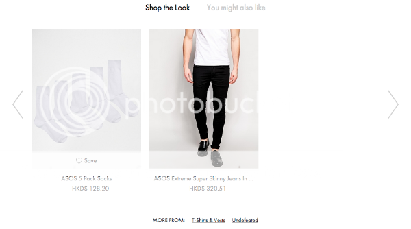
Consider Cross-Selling and Interlinking – If your images have other products in them, consider linking to them as a means to cross-sell. Also, consider linking to other valuable information like guides on how to use your product or anything that could enhance the experience. In the image below, the primary product was actually a shirt, but the vendor smartly included the rest of the outfit on the same page.
3.Offer Product Reviews
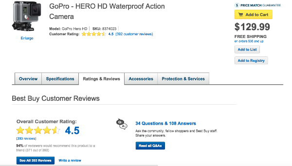
Unless your product or service sucks, reviews are gold for any business. They use both visual and textual cues to create a safety in numbers mentality, allowing customers to see that other people have bought this item and (hopefully) enjoyed it. UK retailer Argos found that products with reviews had conversion rates 10% higher than those without. Checkout how Bestbuy (below) shows you the number of reviews next to the product image in addition to listing them fully in the corresponding tab.
-
Don’t Be Afraid to Ask – If you haven’t been asking customers to review their purchases, don’t worry, just send them a follow up email asking for their $.02. Also think about adding a “Write a Review” CTA for all products.
-
Test Locations – A/B testing is an integral part of conversion optimisation and it’s about time we mentioned it in this post. You will want to test the location of the reviews on your product pages to see if it results in any difference in sales.
-
Leverage the Best Reviews – Someone write an awesome review for your product? Consider using it in a marketing campaign, tweet, or on your homepage.
4.Provide Reassurances
We have said this before, but do not assume your customers are comfortable buying things online or even internet savvy. Play it safe and assume they need reassurances before making a purchase and be prepared to take the steps necessary to prove that your site is legitimate and worthy of their business.
-
Obvious Customer Service – Start by putting your phone number and/or email in plain site, you want customers to call you if they have a question instead of abandoning their session. One site took it even further and offered a live chat option, a decision that increased their conversions by up to 50%.
-
Social Proof – In addition to reviews, make sure to offer links to your social profiles on every page (usually in your footer). Shoppers expect you to have these and it shows that you are real and accessible.
-
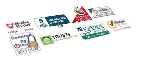
Trust Seals and Badges – This is another thing definitely worth testing. Just because you might be satisfied with just a SSL certificate doesn’t mean your customers will be as reassured. Consider adding a security badge or trust seal to your site and see if conversions increase.
5.Pay Attention to Details
Let’s include one more saying for this post: the devil is in the details. It’s quite easy to devote most of your time to improving images and creating amazing descriptions, but do not neglect the little things that can make or break a product page.
-
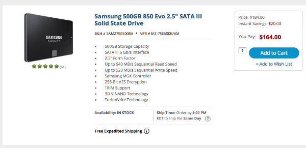
Shipping and Availability – Do not make your customers add an item to their cart to see if it’s in stock and how expensive it is to ship. Both of these (as well as any relevant policies) should be clearly stated on the product page. And with 66% of abandoned shopping carts linked to shipping costs, shipping calculators have become a necessity. Also, if you have a brick and mortar store, you should be listing whether or not it’s available there as well.
-
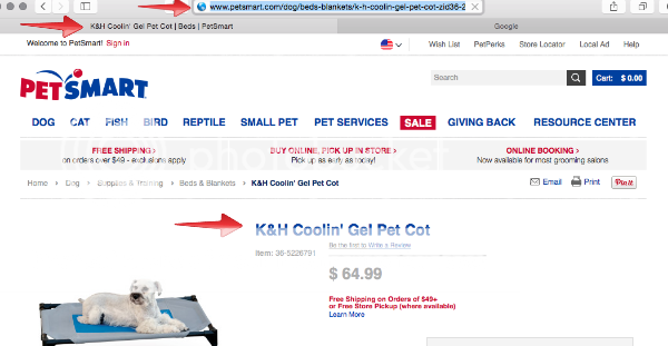
Page Title and URL – Both of these are commonly overlooked but will make a big difference in the outward appearance of your site. I understand that designing the menus and navigation for a large site can be daunting, but using arbitrary numbers instead of descriptive text will hurt you. All of your page titles should clearly state what item is offered and match both the item name in the URL and on the page.
It doesn’t matter if you’re selling cleaning supplies or imported luxury goods, these suggestions apply regardless of product. With close to 2 billion sites now currently online, it is almost guranteed your customers have other options if your site isn’t cutting it. And while implementing all of these will not be easy (especially if you have a large site), taking the time to do so will yield results.
Do you have any other suggestions for optimizing a product page? Let us know in the comments below!


