67.93% Of All E-Commerce Visitors Abandon Checkout. Want To Know Why And How To Fix It?
Reduce your shopping cart abandonment today
According to a study by Baymard Institute, the average E-Commerce checkout abandonment rate is approximated to be 67.93%
The #1 Reason
For Checkout Abandonment
The majority of online shoppers said they were either unprepared to buy at the moment or were deterred by shipping fees
Top Reasons Shoppers Abandoned Their Shopping Carts
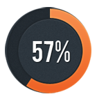
Just window shopping
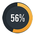
Buy later
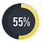
Shipping cost is too high
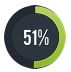
Didn’t qualify for free shipping
![]()
Shipping & handling costs unclear or listed late
Quick Wins – Offer ‘Free’ Shipping!
The most important ‘quick win’ to put yourself ahead of the curve is to add free shipping to your E-Commerce site if you don’t have it already.

But what do I do after that?
Here’s some of the other opportunities for improvement we’ve found with past clients …
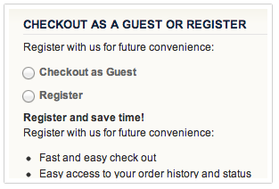
Allow Checkout Without User Registration
One of the most common problems we see in E-Commerce sites (especially those based upon Magento or similar platforms) is the standard one-page or multi-step checkout process that requires user registration by default. Forcing the user to register or select how they’re going to buy is an unnecessary friction point in your sales funnel. By altering your checkout process (which often requires custom development), you can see an immediate reduction in checkout abandonment.
Make Checkout Process Straight-Forward & Easy
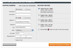
One of the biggest challenges you face in your checkout process is friction. Remember: Friction is your enemy. You want to reduce it. You should minimize the number of forms fields. You should not ask for the user to select ‘free shipping’ if that’s the only option. If you only serve customers in one country, you should set that as the default country. You should hide the coupon code field because it will deter people who don’t have a discount coupon code. In other words, you should make the entire process straight forward and easy.
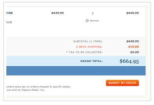
Order Summary Before Order Confirmation
Have you ever been on an E-Commerce site planning to buy something, kind of in a daze late at night and you enter the billing page and you can’t remember exactly what you were buying? It happens more than you think with your customers. By reminding the user of what exactly they’re buying throughout the checkout process, you’re reminding them what they’re buying which gets them excited and amplifies their desire to purchase.
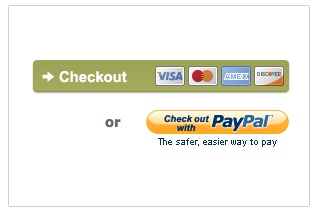
Additional Payment Options
This is one we see a lot with some of the smaller E-Commerce companies. You get started selling in your spare time and start with PayPal because it’s easy to use, easy to register for and it works. You don’t bother applying for a merchant account because sometimes the approval process can be lengthy and difficult. Unfortunately, it’s been shown that many customers don’t always like using PayPal and offering credit cards can help reduce checkout abandonment. Don’t forget American Express, either!
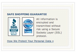
Add Trust Seals & Logos
You’ve probably seen them around the web, and maybe not even noticed them before? They’re called trust seals or trust badges. Some of the common one includes: Better Business Bureau, BizRate, VeriSign, Norton and TRUSTe. Which ones to use? It depends on what industry you’re in and what kind of products you’re selling, but having any is better than having none.
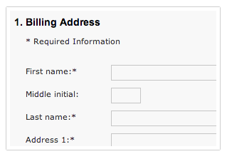
Don’t ask for the same info twice
What’s your shipping address? Now, what’s your payment address? What’s your ZIP code? Now, what’s your state? Stop. Think about it – do you really need shipping address AND payment address? Isn’t it usually the same thing? Can’t you look up the state from the users ZIP code? Basically, there’s no need and with some custom programming & development, you can easily remove the need for these fields.
The same goes for ‘First Name’ and ‘Last Name’. Just ‘Full Name’ is sufficient. Your customers appreciate it when you make life easy for them.
And that’s just the tip of the iceberg.
The Conversion Uplift 74 Point Check-list For Checkout Optimisation
- Use shipping address as billing address by default.
- Only ask for the same information once.
- Indicate required and optional fields.
- Preserve all customer input despite errors in the form.
- Show examples of input format.
- Use only a single ‘Name’ field.
- Validate form fields inline.
- Remove select features (e.g: a drop-down) when there’s only one option.
- Auto-detect city and state immediately after ZIP code/postcode is provided
- Disable the paste-function in the e-mail confirmation field.
- Only use drop-down lists when there are less than 20 options
- Keep labels visible at all times
- Use geo-targeting to auto-select smart defaults for your customers
- Add new input fields below the trigger-field
- Form field length should never conflict with the expected input length.
- Add descriptions to form field labels.
- Descriptions should be concize.
- Provide additional information when introducing ‘special’ features
- Avoid technical jargon.
- Avoid using contextual words like ‘Continue …’
- Make it clear when you actually purchase
- Use clear and meaningful shipping names
- Format the ‘expiration date’ fields as they appear on the credit card
- Use clear error indications
- Make ‘Guest checkout’ a prominent option
- Only use one column for form fields
- Curate the options you present during checkout
- Use animated graphics very cautiously
Want to identify and fix the checkout weaknesses on your site?
Claim your FREE website strategy session
- Speak to an expert
- Actionable conversion-boosting recommendations
- Increase online leads and sales
Frequently Asked Questions About Our Checkout Optimisation Strategy Session
Q: Do you integrate with <E-Commerce Company XYZ?>
A: We integrate with many e-commerce solutions, including: