11 Ways To Optimize Your Online Shopping Cart And Checkout
How to Recoup Lost Shoppers and Increase Conversions
Note: This post was originally authored by Quincy Smith.
According to Baymard, 68% of shoppers abandon their online shopping cart before completing their purchase. This results in e-commerce companies losing an incredible $4 billion dollars of revenue from a single stage of their funnel: the checkout process.
Let that sink in for a second – companies are losing out on billions of dollars every year not because of their products or marketing, but because their online shopping cart is either too confusing, complicated, or unappealing to their customers. While the argument can be made that some abandonment is unavoidable, there are steps you can take to decrease your abandonment rate and turn shoppers into buyers.
Keep It Simple
1. Don’t Require Registration
This is number one for a reason – forced registration is like kryptonite to a checkout process. Your best bet is to mimic Apple and provide a guest checkout option where your customers can proceed without creating an account:
If your customers absolutely must register, then forgo the traditional “Create an Account” or “Register” buttons for one that says “Continue.”
Retailer ASOS did this and saw an 50% decrease in abandonment for that step of the process.
2. Don’t Ask for Too Much Information
This study from VWO saw an 11% increase in conversions by removing 3 fields from their registration form, proving that less is more during checkout and you should only ask for information that is absolutely needed. According to Jesse Ness of Ecwid
Any extra field or information that is requested beyond what is necessary to complete the order reduces the conversion rate.
This means fields like middle name, business phone number, and business name can usually be omitted or at the very least marked as a non-requirement.
3. Localize for International Shoppers
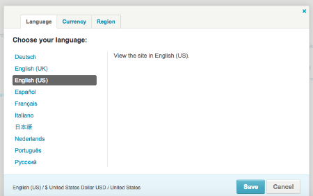
If your company offers international shipping, you might be bleeding potential customers if you don’t allow shoppers to switch between currencies or languages. Both
Shopify and Magentoallow for these options and even offer location-based defaults depending on the configuration.
A good place to start with this is Google Analytics – check out all the countries from which you receive traffic and compare that against your actual sales from those countries. If your conversion rate is disproportionate to your domestic traffic and sales, then it’s time to consider a change.
Etsy does both of these really well, they offer the ability to change between both currencies and languages as well as filter by products that ship to your region.
4. Remove Navigation to Pages Outside of the Checkout Funnel
Once a user is ready to checkout, you want to do everything you can to provide that final nudge towards converting. This includes simplifying the page by removing all distractions, the biggest of which is the ability to navigate away from the process. Removing all links to pages outside of the checkout process will help keep customers focused on completing the checkout steps without temptation.
Make the Customer Feel Secure
5. Don’t redirect to a different URL
If you have ever been redirected during checkout from a known website to an obscure e-commerce payment site then you know the impact it can have. If not, imagine you are about to purchase some prime treats from vegandogfood.com and they redirect you to randomecommercesite.com to handle your checkout and payment – what would you think?
You’d likely think something along the lines of:
- Why am I here?
- Is this site secure?
- Do I want to take the risk of giving them my credit card information?
A lot of people will backout of the sale at this point because they don’t trust the redirect (even I have cancelled past orders because of this and I understand why they redirected). Even though online shopping is far from a new concept, shoppers are still weary of giving out their payment information and confusion like this can spook them.
Ideally your checkout page should share your URL and utilize words like ‘checkout’, ‘buy’, or ‘purchase’. Amazon does a great job of this by using ‘buy’ as well as showing you what step you are on (in this case it’s shipping).
6. Display Trust Seals
As we mentioned above, many customers are nervous about handing over their shipping and billing information online, even when the site is extremely secure. One way to minimize this nervousness is by prominently displaying security badges and seals. A case study by Lemonstand showed a 14% increase in conversions simply by adding these seals and badges to a site.
7. Awesome Customer Service
No matter how savvy the shopper or optimized the site, people will always make mistakes and have questions. The key to saving these customers is often a clear and obvious customer service presence that can come to their rescue. Your best options are an online chat function (like Wiggle) or an obvious phone number (like Crate and Barrel), but we’d love to see you test them both!
Wiggle:
Be Transparent
8. Show All Fees and Taxes
While being transferred to some obscure site during checkout can be frustrating, a site that doesn’t show the total cost of an item (or worse, tries to hide it), is infuriating. Your checkout should be 100% transparent and there should be no surprise charges or fees when a customer is ready to submit their payment. This means you should display:
- Item price
- Tax (if applicable)
- Shipping (if applicable)
- Miscellaneous fees
The most notorious of these surprise fees is the ‘processing fee,’ a term that is about as ambiguous as you can get. If you charge a processing fee we highly recommend calling it something else to reflect its true purpose – doing so will increase your credibility.
9. Display Checkout Steps
Think of your checkout like a map – customers want to know where they are and how much further they have to go to complete their order. Al Brookbanks, founder of CubeCart, recommends making sure
“The user journey to checkout is very clear after an item has been added to the basket.”
We hesitate to call the inclusion of a progress bar a requirement since we are firm believers in testing everything, but it’s pretty close.
Again, Amazon is a great example:
Don’t Give Up Without a Fight
10. Send Follow Up and Reminder Emails
Don’t worry if a customer decides to abandon their cart on your site, all hope is not lost. Assuming the customer was logged in during their session, you should still be able to close some of those sales if your e-Commerce platfrom tracks abandonment. For example, CS-Cart allows admins to filter by how long a cart has been abandoned and send those users emails that mention the forgotten items.
Additonally, remarketing services like RejoinerandSaleCycle,help companies send follow up messages to customers who left without completing their purchase and include reminders, images of the abandoned items, and discounts. According to SaleCycle, nearly half of recovery emails are opened and 1/3 result in a sale, meaning it’s definitely worth your time to develop and implement a remarketing plan.
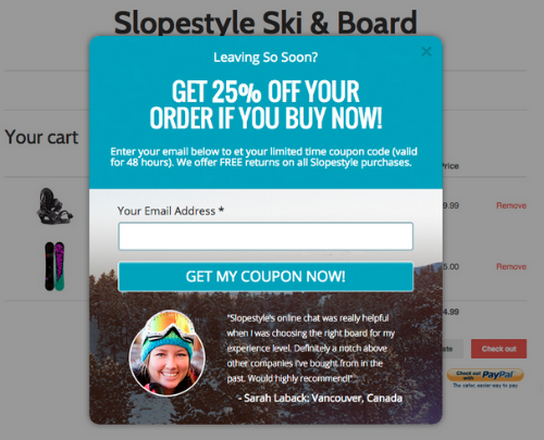
11. Use an Exit Popup
If the user is not signed in during their session or doesn’t have an account, another option you have to save the sale is to convince them not to leave your site at all (or entice them to come back). Consider using an exit popup to offer a discount or coupon if a customer tries to leave your page at any point during the checkout process. Not only will this keep them interested, but it also might provide you with their email if they opt in, which is a decent consolation prize if they never convert.
Test Everything
Your company should be living by the motto “always be testing.” Never assume you can just apply everything listed above and reap the benefits – every site and every customer is different, it is important to test what works best for you. In addition, don’t go crazy and test everything at once, start by developing a plan and test over a period of time to ensure your results are statistically significant. Once you prove or disprove one hypothesis, then you can move onto the next.


